Compare Room Colour Beside the Main Window
Compare Room Colour Beside the Main Window. Concrete choices for retained rooms, useful belongings and ordinary time at home.
Licensed editorial lifestyle photography. Images illustrate the setting; pictured items are not product endorsements.
Compare the colour where it will be seen
A room colour can appear different beside the main window from the same sample viewed at the back of the room. Begin with the actual retained wall, furniture and ordinary daylight. Choose an appropriate sample method through the product information rather than relying on a small online swatch.
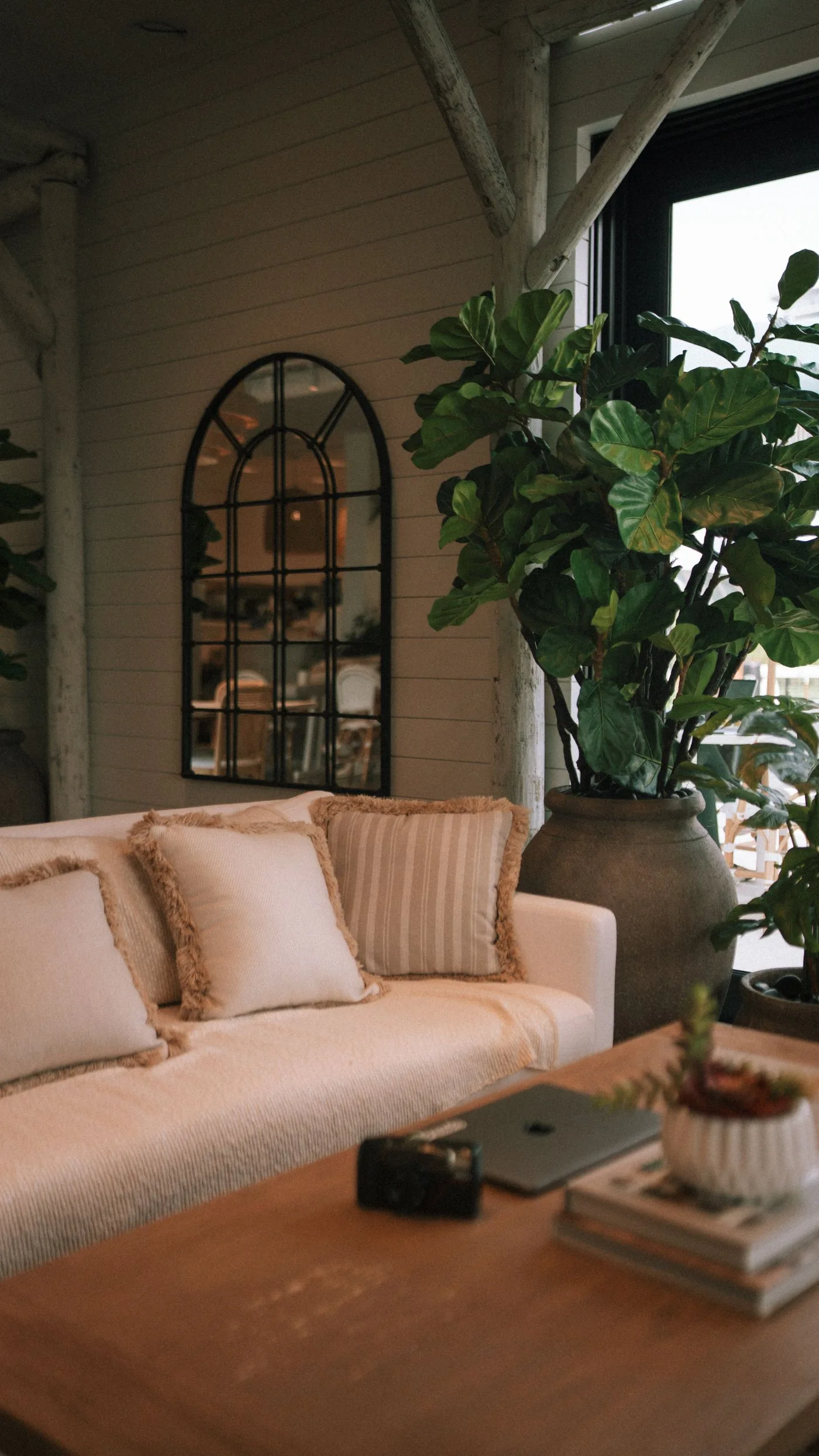
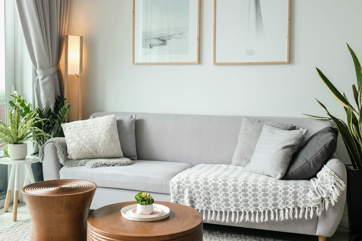
The living-room photograph illustrates pale colour beside a window; it does not verify a specific paint or guarantee the same appearance in another room. The useful comparison belongs to the actual setting.
Keep a retained reference in view
Place the appropriate sample where it can be compared with the furniture or textile that will stay. Notice the relationship rather than judging the new colour alone. A grey sofa, cream curtain or wooden surface may make the same proposed tone feel different to the person choosing it.
Our movable sample guide considers a bedroom comparison. Its principle of a clear real-room reference helps here, while the actual paint and application requirements remain specific to this product.
Observe ordinary changes in light
Compare the suitable sample through relevant ordinary room conditions and record when each observation was made. Keep the sample identity clear. A note saying looks warm is less useful than naming the actual sample beside the retained sofa in the morning view.
Do not expect a camera image to reproduce every subtle colour difference. A private reference photograph may preserve the comparison's context, but the actual sample in the room remains the relevant visual evidence.
Keep neighbouring rooms in the decision
If the window-side room is seen from another occupied space, consider the ordinary view between them. A colour may work locally while creating a different relationship through an open doorway. Decide how much connection you want rather than assuming every room must match.
The adjoining room guide keeps that relationship specific. One retained tone or material can provide a connection without turning a local sample comparison into a plan to repaint every surrounding wall.
Make one bounded colour decision
Choose the appropriate option that serves the actual room and your preference, or identify the particular uncertainty still needing clarification. Keep practical preparation, application and product suitability questions with the real manufacturer's guidance and appropriate expertise where needed.
What if the sample only appeals in one photograph? Revisit the ordinary local view before relying on the image. What if the retained furniture changes the impression? Keep that actual relationship in the decision rather than judging the paint as an isolated swatch. A considered window-side colour choice connects light, retained objects and real room use.
Record the selected product and exact colour reference if a change proceeds. A broad name such as pale grey may not identify the actual option that was compared and chosen.