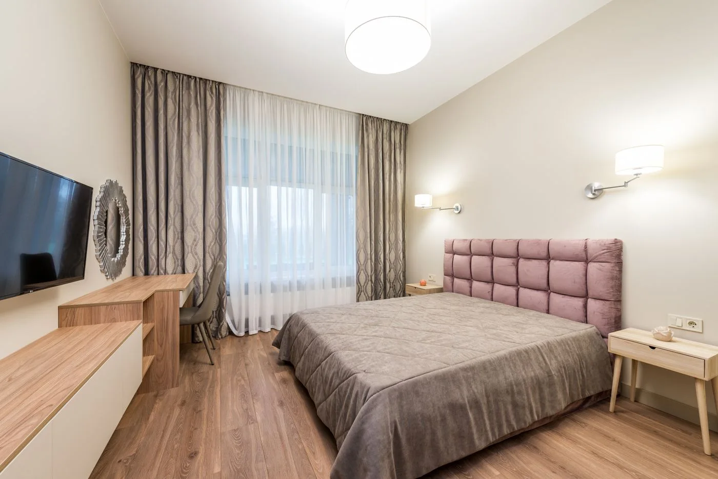
Compare a Colour Link Between Adjoining Rooms
Look through the actual doorway before repeating a kitchen colour across the whole home.
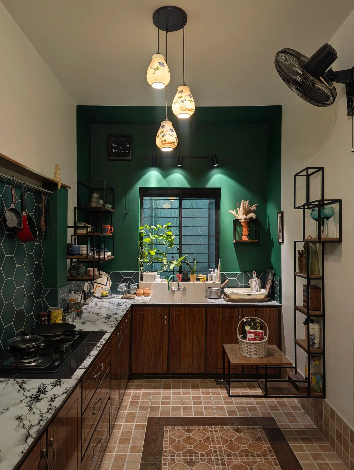
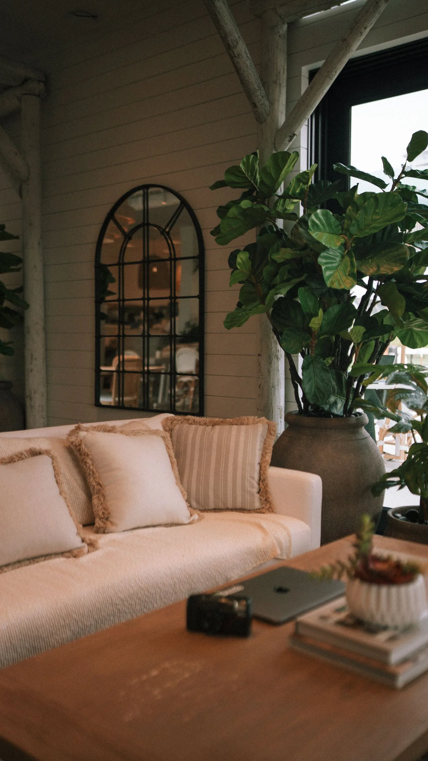
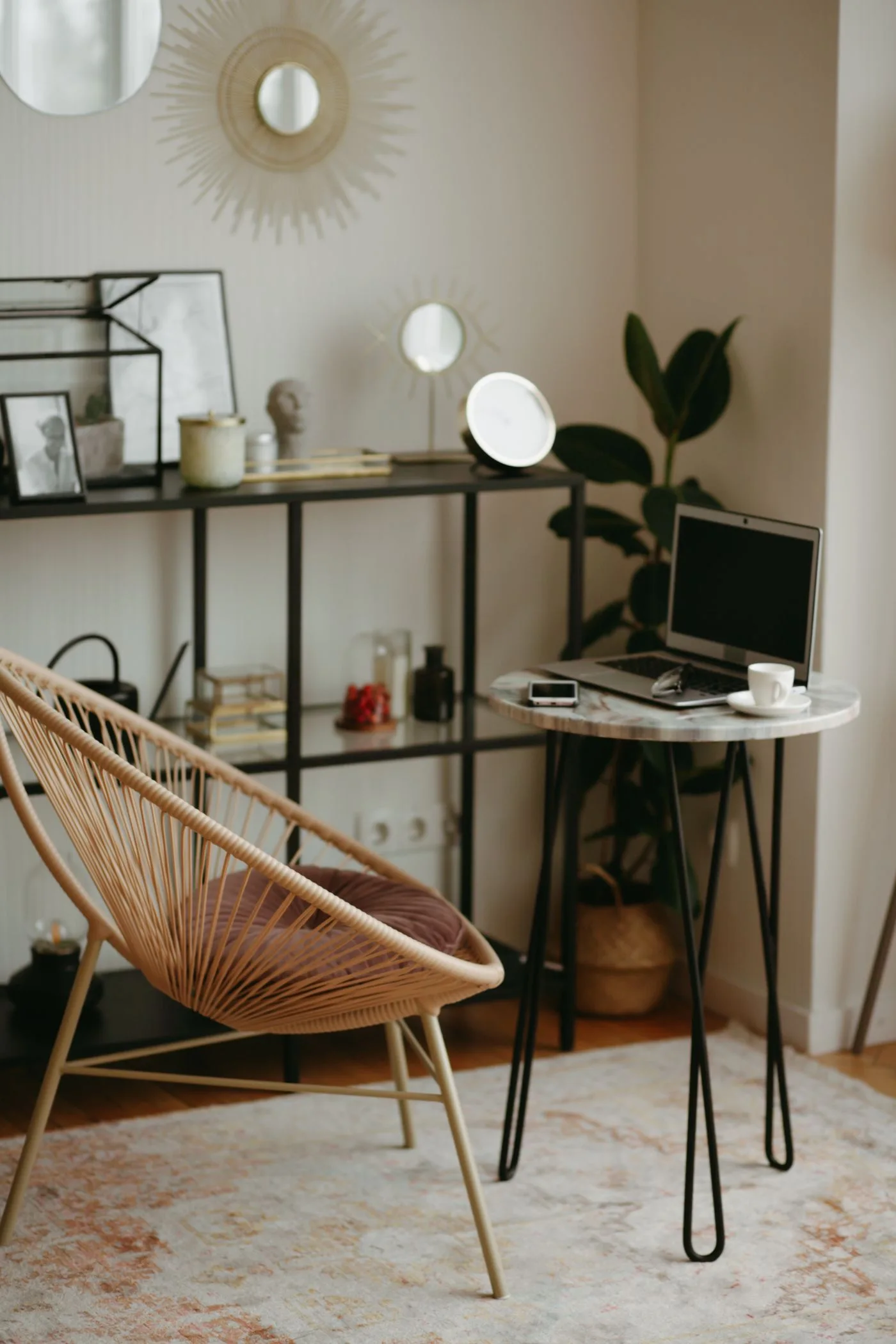
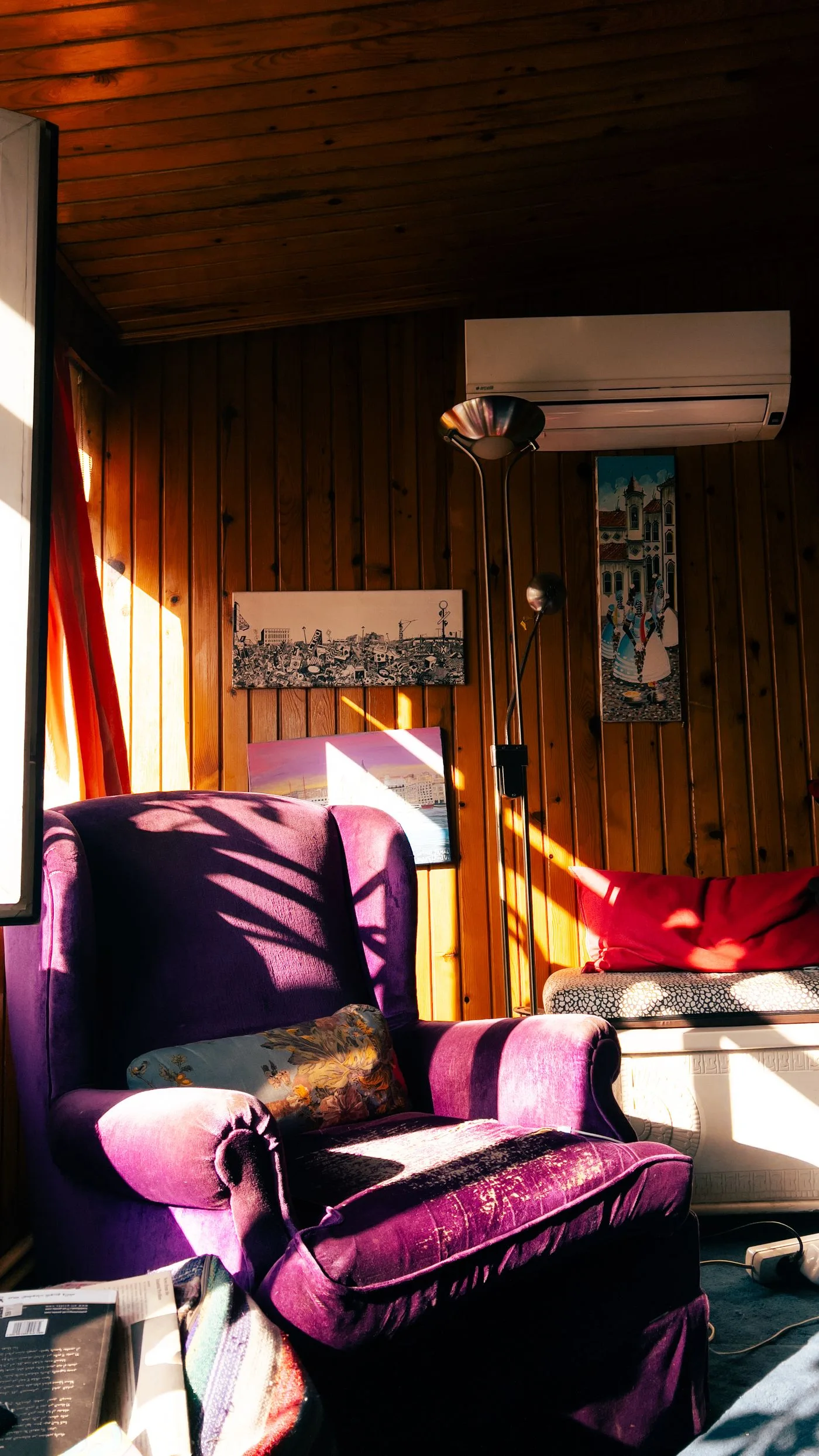
Licensed editorial lifestyle photography. Images illustrate the setting; pictured items are not product endorsements.
Stand at the real connection
Adjoining rooms do not need identical colour schemes to feel connected. Stand where both spaces are normally seen together and identify the actual visual link. A doorway may reveal one cabinet edge and a chair rather than the whole room shown in a floor plan.
Begin with retained materials. Notice which colours and textures already repeat without another purchase. The task is to choose a relationship you enjoy, not impose one palette on every room regardless of its use or light.
Choose the scale of repetition
A small repeated detail can create a connection without duplicating a large surface. Compare a suitable existing textile, frame or other object with the adjoining room. Keep the object's own care and placement requirements in view.
Decide where the emphasis belongs. If the kitchen already has a strong cabinet colour, the next room may only need a modest echo, or none at all. There is no requirement to make every visible object participate in the same colour plan.
Check the rooms at ordinary times
View the relationship under the daylight and lamps commonly used in each space. Different lighting can change how materials appear together. Avoid deciding solely from two separate product photographs or expecting a screen to reproduce the exact colour.
Our kitchen guide keeps the working room practical. The kitchen decoration guide helps find an appropriate visual position without occupying needed preparation space. A colour connection should fit those functions.
Try retained pieces before changing surfaces
Where appropriate, compare a movable existing item in the proposed position. Check what its original room loses and whether the new place suits its dimensions and intended use. A visual trial should not depend on unsafe support or unsuitable product placement.
If paint or another fixed finish is considered, use the actual product's sample and application guidance. A small colour relationship does not automatically justify changing a whole wall. Keep installation, surface suitability and visual preference as separate decisions.
Let each room retain its purpose
Review the connection while both rooms are being used normally. A dining space, kitchen and quiet seating corner may benefit from different materials and arrangements. Repeating a colour is optional where the rooms already feel coherent to the people using them.
Our sample board guide offers a considered colour comparison, with product limitations kept clear. The dining guide supports the practical room arrangement. Keep the smallest suitable change that achieves the relationship wanted.
Adjoining colour questions
Must rooms visible together share a palette? No. Different schemes can sit together successfully without identical colours.
Can one small object provide the link? It can if the effect is wanted and the object has a suitable position.
What if the repeated colour feels forced? Remove the optional addition and reassess the existing relationship before expanding it.