Compare Retained Textile Colours in Ordinary Daylight
Compare the textiles already staying in the room in ordinary daylight before choosing another colour or material.
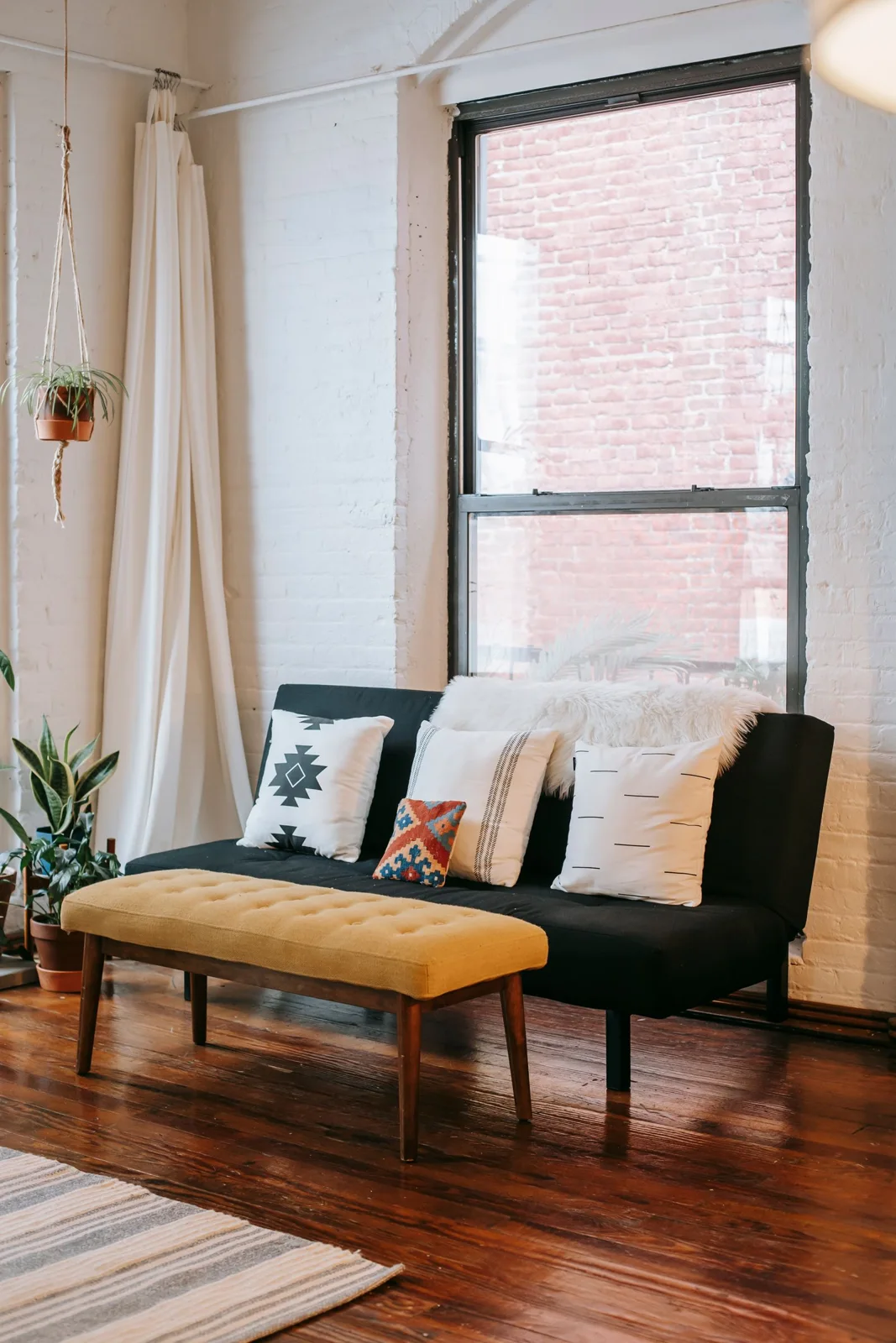
Licensed editorial lifestyle photography. Images illustrate the setting; pictured items are not product endorsements.
The textiles staying in a room are a useful starting point for choosing another colour. Look at the actual curtains, cushions or other relevant pieces in ordinary daylight rather than building a new scheme around a small image on a screen. The comparison is about how the existing group appears in that room. It does not establish colourfastness or another product property. Follow the items' care guidance and keep the exercise modest: one clear view of what remains can be more useful than a large collection of unrelated new samples.
Gather the pieces that genuinely stay
Identify the textiles you intend to retain and distinguish them from temporary alternatives being considered. Keep their actual condition and care needs clear. There is no need to remove every fabric item in the house to compare one room. Choose the group that affects the decision, such as the sofa textile and curtains visible together from the usual seating position. A relevant small collection gives the comparison a practical boundary and prevents a new purchase from becoming the starting point for replacing pieces you still enjoy using.
Look in the room's normal daylight
Use the ordinary positions and times when you see the room, keeping handling appropriate to the textiles and surroundings. Avoid treating a single unusually bright photograph as the whole picture. Light can make the appearance differ from a screen reference, so compare the actual objects where possible. Do not leave materials in an unsuitable position or infer their resistance to sunlight from a brief look. The useful observation is the room's current appearance, not a product test or a promise that a particular colour will remain unchanged over time.
Compare one proposed addition
If considering another textile, use an appropriate sample or the actual item where available under suitable conditions. Check current product information and applicable terms directly with the provider. Compare it with the retained group before adding several other choices. A colour that works with one cushion may look different beside the curtain or larger seating surface. Keeping the comparison local makes the reason for a preference clearer. It also helps you recognise whether the proposed addition contributes something useful or simply repeats a colour already present in the room.
Include ordinary use and care
Consider the role of the item as well as its appearance. Read the actual care information and choose something appropriate to the household's routine. A decorative colour decision should not obscure an unsuitable material or an item whose maintenance cannot realistically be managed. Keep measurements and relevant product details separate from personal preference so both parts of the choice remain clear. The retained textiles provide context, but they do not determine that every new piece must have the same construction or be handled identically.
Record only the useful result, such as the proposed colour and the existing pieces it was compared with. Return moved textiles to appropriate storage or use. The room does not need to remain a permanent sample display while you think. A deliberate small comparison can guide the next choice without demanding a complete new scheme. It keeps the textiles you already own part of the decision, allowing another addition to support a real room rather than a collection of colours viewed separately from everyday life.
Continue planning with Connect an Accent Chair With Textiles You Already Own, Compare a Bedroom Colour on a Movable Sample Board.