Balance a Kitchen Island With the Cabinet Colour
Balance a Kitchen Island With the Cabinet Colour. Concrete choices for retained rooms, useful belongings and ordinary time at home.
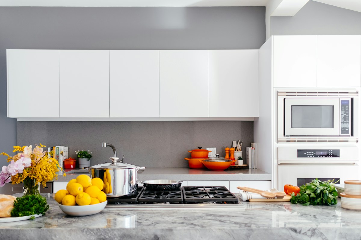
Licensed editorial lifestyle photography. Images illustrate the setting; pictured items are not product endorsements.
Begin with the cabinets that stay
An island colour should be considered beside the actual retained kitchen cabinets, not as an isolated swatch. Keep the actual cabinet, worktop and floor references together while comparing the sample. A decision made beside only one surface may overlook the relationship that dominates the ordinary kitchen view. Begin with the complete room view and the existing materials. Identify which elements will remain so the comparison does not silently assume an entirely different kitchen.
The photograph illustrates a light kitchen and island, not a verified colour specification. Use appropriate samples and actual product information for the proposed finish, and seek suitable guidance where the change involves practical preparation or application questions.
Choose the amount of distinction
Decide whether the island should feel like a quiet part of the cabinet group or a more visible contrasting element. Neither approach requires every surface to match. Compare the actual tones in relevant ordinary light and keep sample identities clear throughout the decision.
Our adjoining colour guide considers connections across a wider view. The island likewise belongs to a retained setting whose surrounding colours may change how the proposed tone is perceived.
Keep worktop and floor references visible
Compare the suitable sample beside the actual worktop and other retained materials. A colour that looks pleasing beside one cabinet door may create a different relationship with the complete room. Record the specific sample and setting rather than a vague note saying the lighter one.
Do not assume an online image reproduces the actual material appearance in the kitchen. A private reference photograph may preserve context, but the real appropriate sample remains the relevant local comparison.
Separate appearance from product suitability
Check that the proposed product and method suit the actual surface and intended use through the relevant manufacturer information. A colour decision does not establish preparation requirements, compatibility or the appropriate work process. Obtain suitable expertise where the real project needs it.
The working kitchen guide keeps the ordinary task visible. A decorative change should support the retained room rather than make its real use disappear behind an inspiration image.
Close the comparison before expanding it
Choose the appropriate colour that serves the actual kitchen and personal preference, or identify the precise uncertainty still needing clarification. Avoid turning one island decision into automatic replacement of neighbouring textiles and accessories merely because a sample introduces a new tone.
What if the island and cabinets feel too close without looking coherent? Compare a clearer distinction through actual samples. What if the preferred colour requires an unsuitable product? Resolve the surface requirements first. A considered island colour connects the retained cabinets, materials and ordinary room use through one bounded decision.
Keep the exact selected colour and product reference with the project information. A broad label such as warm white may not identify the actual finish whose suitability and appearance were checked.