Compare Hallway Art With the Wall That Stays
Compare Hallway Art With the Wall That Stays. Concrete choices for retained rooms and ordinary use.
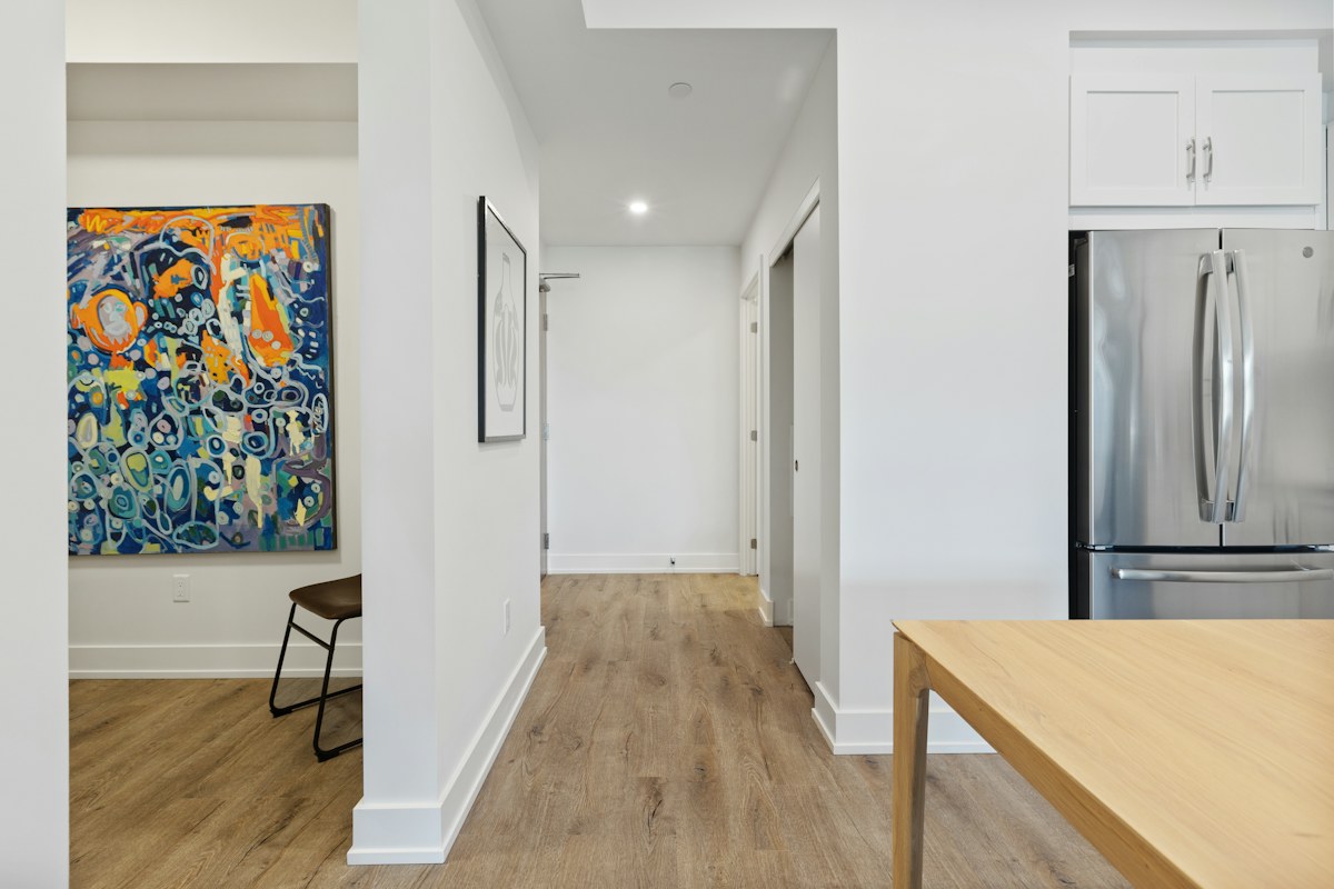
Licensed editorial lifestyle photography. Images illustrate the setting; pictured items are not product endorsements.
Start with the ordinary hallway view
Hallway artwork belongs to a room seen while arriving, leaving and moving between spaces. Begin with that actual view and the retained wall colour rather than selecting a picture from an isolated online mock-up. Notice which artwork and furniture already contribute to the setting.
The photograph illustrates a light hallway with a colourful framed picture. It does not establish an installation method or guarantee the same colour relationship in another room. Keep actual product and fixing requirements central and seek suitable guidance where needed.
Choose one retained picture to compare
Begin with a suitable artwork already owned if available. Look at its colours beside the actual wall in relevant ordinary light. A broad label such as colourful print may conceal tones that relate differently to the retained surfaces. Keep the artwork's identity clear rather than judging from memory alone.
Our personal display guide gives one meaningful object a real room role. Use that modest scale before planning a complete new hallway collection.
Include the neighbouring room
Consider the ordinary view through the nearby doorway. The hallway picture may be seen beside another room's wall, furniture or textile, creating a wider relationship than the local wall alone suggests. Decide how much connection you want without requiring an exact palette match.
The adjoining-room colour guide keeps that connection specific. One retained tone can link the spaces where preferred, while a deliberate distinction may suit the person equally well.
Keep the frame question separate
Compare the actual frame with the picture and wall. A stronger edge can make the artwork more prominent, while a quieter one may leave the colours as the clearest feature. Check the real frame's suitability and requirements rather than assuming a decorative preference justifies an unfamiliar modification.
If the group feels unresolved, identify the specific issue before buying another frame or repainting the wall. A different suitable retained position may answer the visual question without expanding the project.
Record the useful relationship
Keep a modest reference naming the actual artwork, frame and retained wall if a future change is considered. A private photograph may preserve context, but subtle colour decisions should remain tied to the real room in relevant light. Camera rendering can alter the relationship.
What if the picture feels disconnected from the hallway? Compare one suitable retained alternative rather than inventing a new collection automatically. What if the view changes with a door's ordinary position? Include that actual context. A considered hallway artwork choice connects personal objects to the occupied home through one clear local decision.
Preserve necessary installation and product information through its real role. A successful decorative comparison does not establish that a particular fixing arrangement is appropriate for another wall or frame.